Designing the card
The designer opens from Odoo, with your programme, rewards, levels and languages already there. It offers only what Apple Wallet and Google Wallet really show, so what you see is the card.
Open it from Settings → Tieroo → Design the card, or with Design the wallet card on the loyalty programme. Only administrators can open it. The link works once; the designer then stays open for an hour.
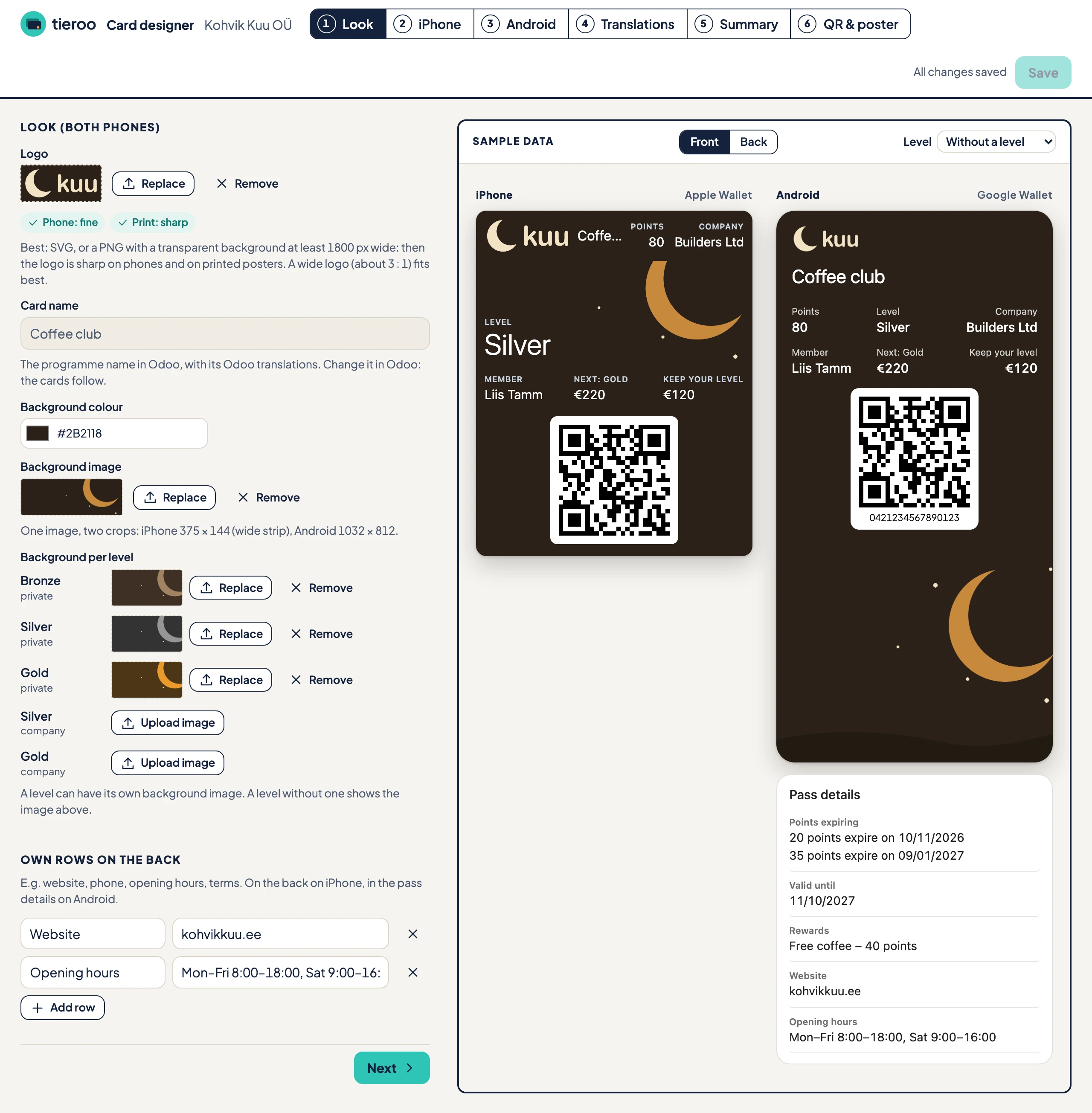
The designer has six steps. On the right is a preview with a sample customer from your programme. Front and Back turn the cards over; with Customer Levels, Level shows the card of one level. Nothing changes on the cards until you press Save.
1. Look
What both phones share.
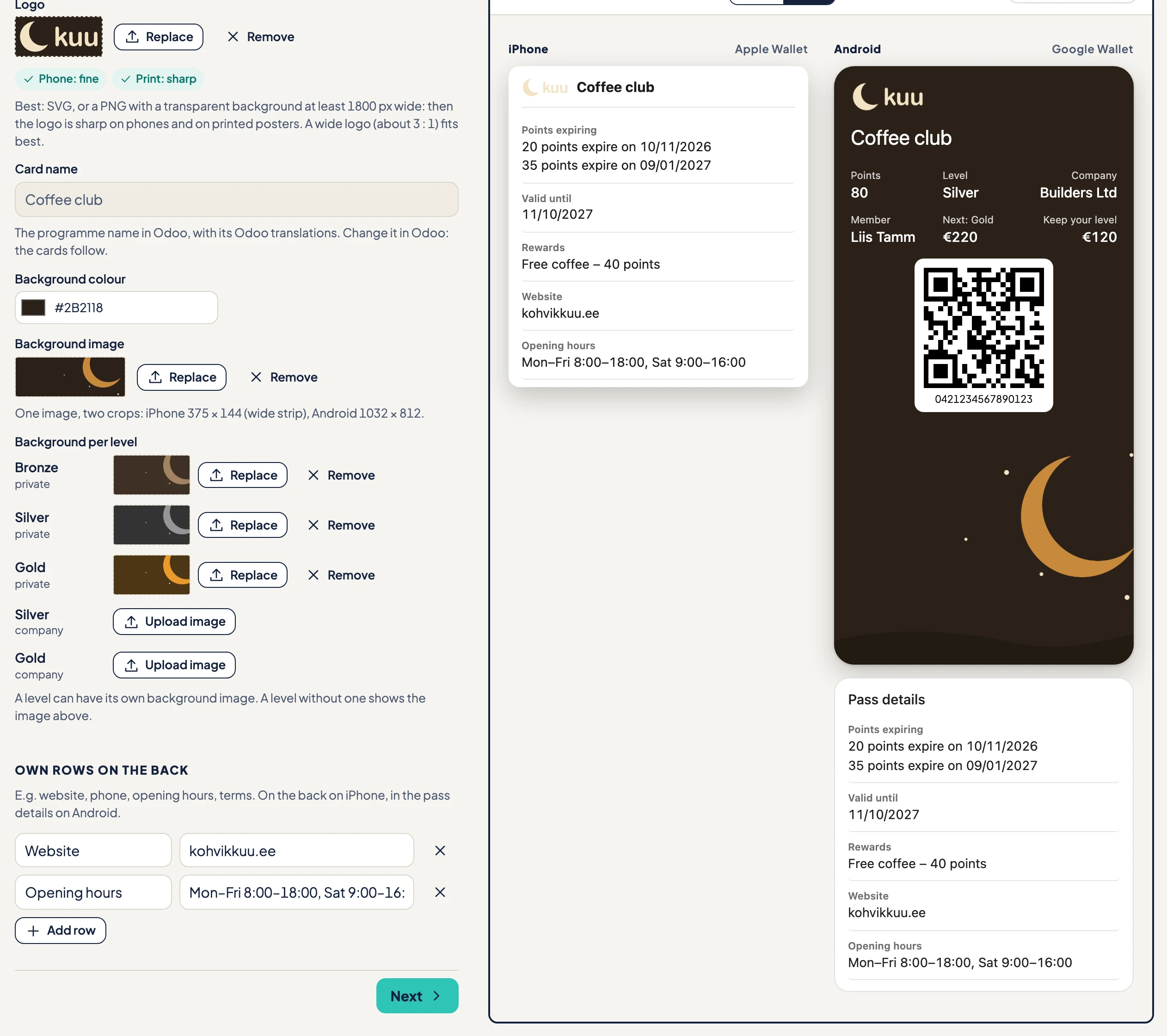
- Logo. Upload an SVG, or a PNG with a transparent background. The designer checks it twice: Phone (sharp enough on a phone) and Print (sharp enough on the poster). A PNG at least 1800 px wide passes both. A wide logo, about 3 : 1, fits best.
- Card name. The programme name from Odoo, with its Odoo translations. You cannot change it here: change it on the programme in Odoo and the cards follow.
- Background colour. The colour of the card on both phones.
- Background image. One image, cut two ways: a wide strip on iPhone and a large image on Android. Use one at least 1125 × 812 px so both are sharp.
- Background per level. With Customer Levels, each level can have its own background image. A level without one shows the image above.
Own rows on the back
Rows of your own, such as the website, phone number, opening hours or your terms. Each row has a title and a text. They appear on the back of the card on iPhone and in the pass details on Android, after the rows Tieroo fills in itself (points expiring, valid until, rewards).
2. iPhone
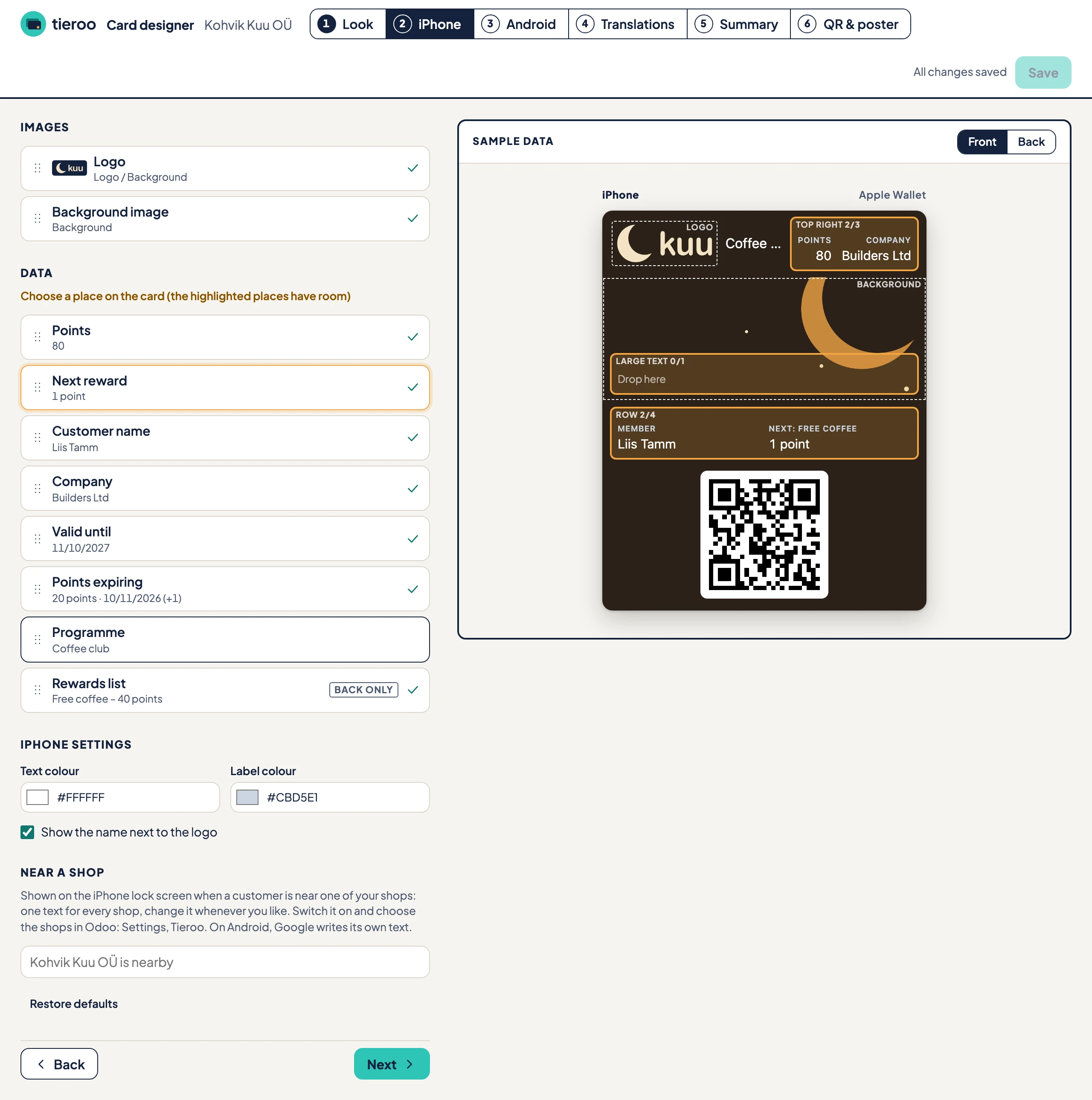
Where each piece of data sits on the Apple Wallet card.
- Images: where the logo and the background image go.
- Data: every field Tieroo can show. Drag a field onto a place on the card, or click a field and then a place; the places with room light up. A tick means the field is on the card. Back only fields go only on the back.
The places on iPhone: Top right (up to 3), Large text (1, over the background image), Row (up to 4) and Back.
Field settings
Click a field on the card to set it up.
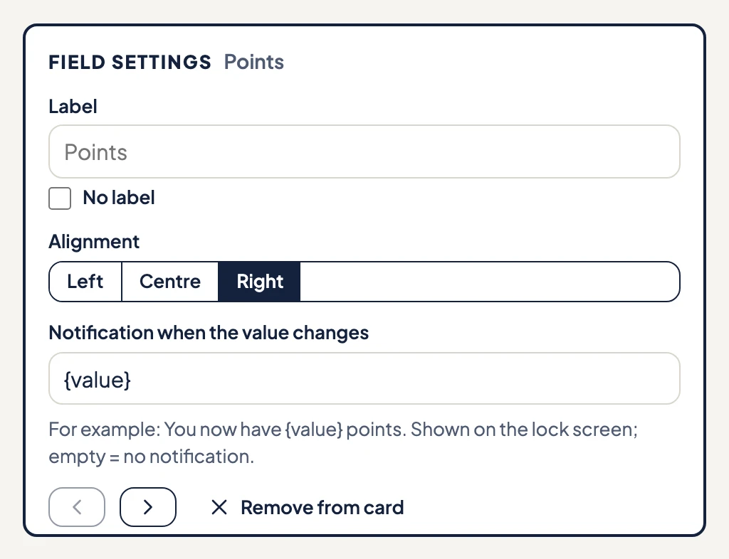
- Label: the small title above the value. Empty means the standard label in each language. No label hides it.
- Alignment: left, centre or right, in Top right and Row only.
- Notification when the value changes: the text on the lock screen when this value changes, with
{value}for the new value, for example "You now have {value} points". Empty means no alert for this field. Points expiring have no alert of their own: the expiry reminders cover them. - The arrows move the field earlier or later in its place. Remove from card takes it off.
iPhone settings
- Text colour and Label colour. The designer warns when they are hard to read on the background.
- Show the name next to the logo. With a wide logo there is little room left, and a long name is cut short.
Near a shop
The text on the iPhone lock screen when a customer is near one of your shops, one text for every shop. You switch the feature on and choose the shops in Odoo (see Shops on the card).
Restore defaults puts the card back to the standard layout. The Android step has the same button.
3. Android
The same data for the Google Wallet card, with Google's places: Row 1 to Row 3 on the front and Pass details below the card (up to 10). Google allows three rows and recommends at most two.
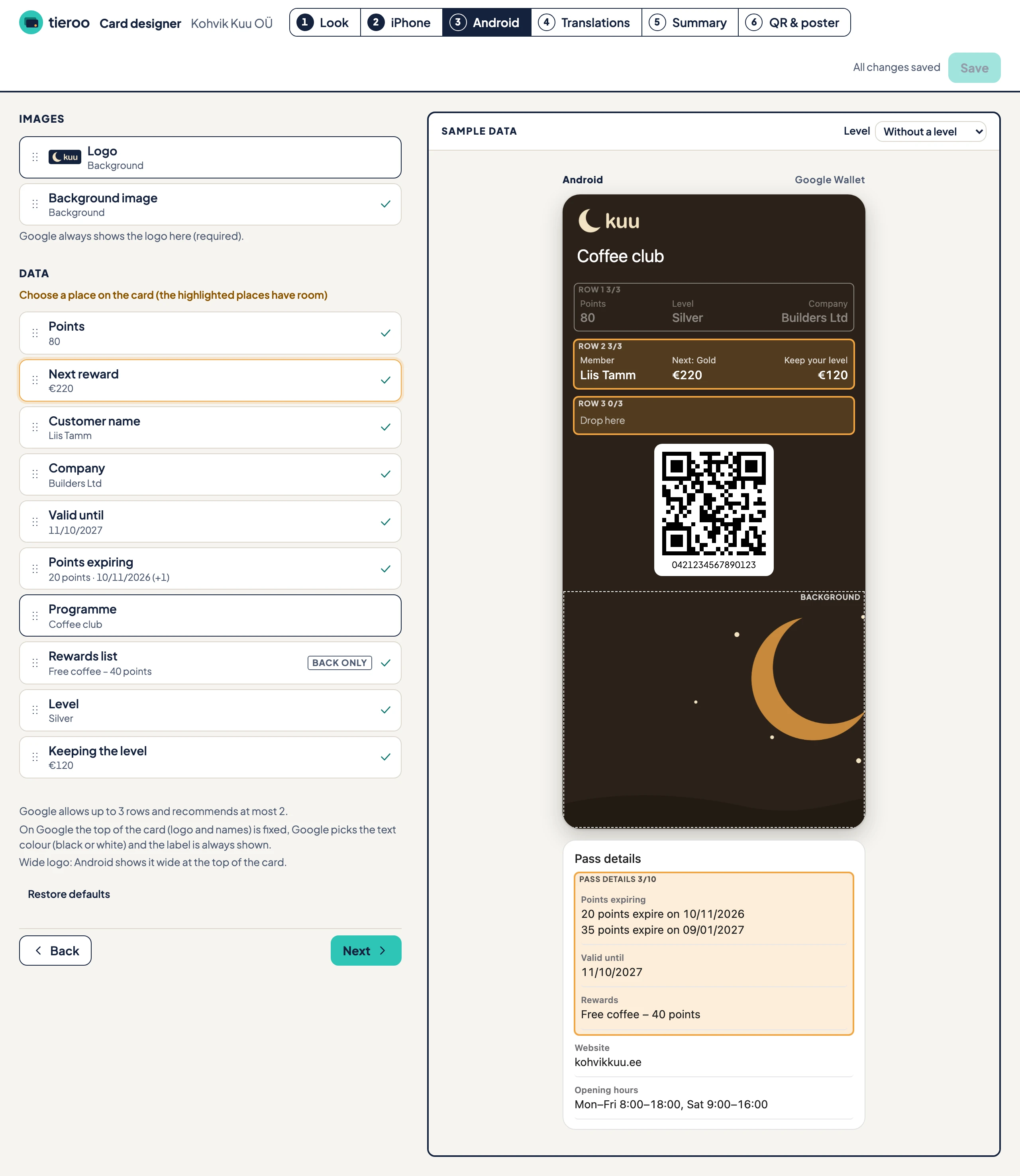
The top of the Android card is fixed: Google always shows the logo and the card name there, and may shorten a name longer than 20 characters. Google picks black or white text by itself, and the labels are always shown. Your own lock-screen texts (a value changes, near a shop) are for iPhone only; Android shows Google's own notifications.
4. Translations
Each customer gets the card in their Odoo language. This step has every text of the card, one tab per language active in your Odoo.
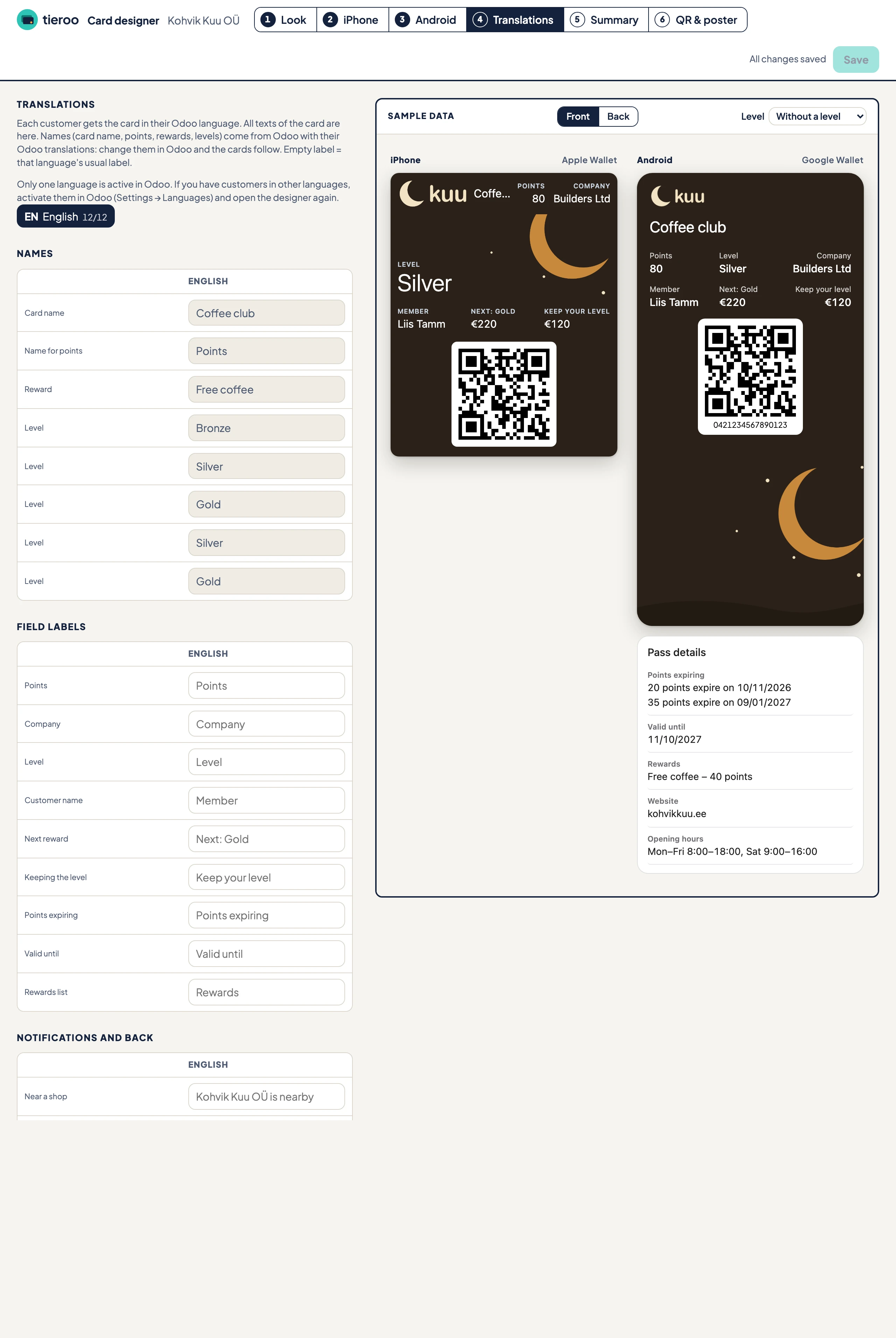
- Names: the card name, the name for points, the rewards and the levels. They come from Odoo with their Odoo translations, so they are shown here but changed in Odoo.
- Field labels: the labels on the card. Empty means the usual label in that language.
- Notifications and back: the alert texts, the text near a shop and your own rows.
For languages other than English and Estonian, the step asks you to have a native speaker check the texts. If you have customers in a language Odoo does not have active yet, activate it in Odoo (Settings → Languages) and open the designer again.
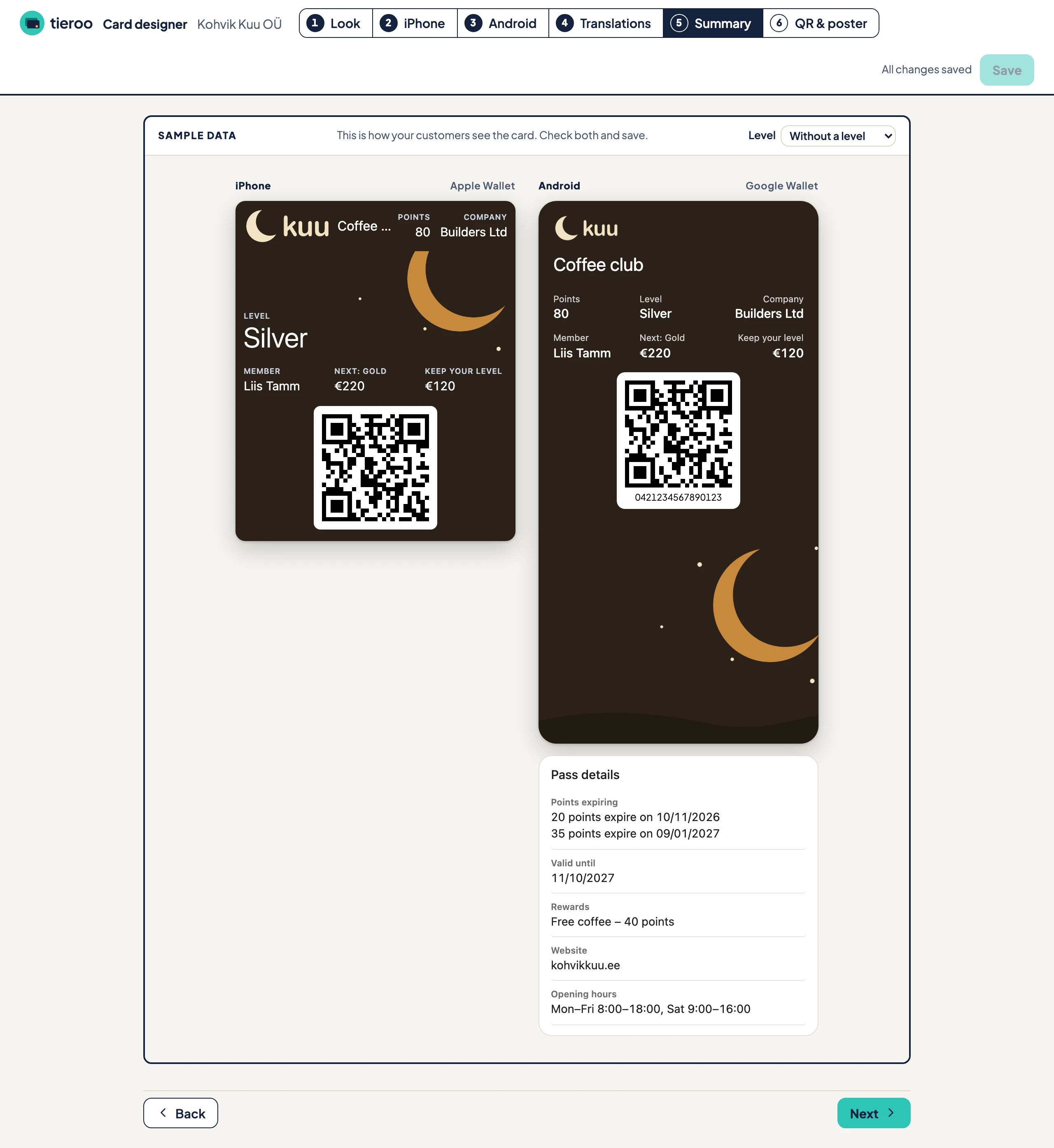
5. Summary
Both cards as your customers will see them, front and back, with the sample customer. Check both, then press Save. The designer asks you to confirm and says how many customer cards the new design goes to. The new look reaches every phone within a few minutes.
6. QR & poster
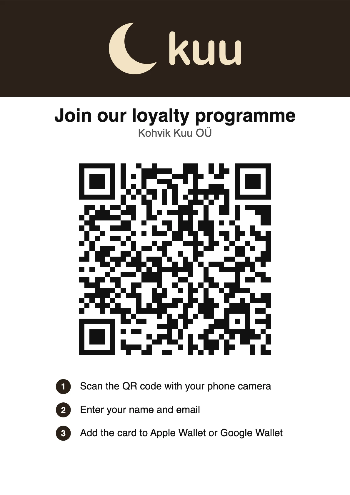
The join poster for the counter. Its QR code opens your join page (see How customers get the card). The poster uses the logo and background colour of the saved design, so save first.
The poster with Kohvik Kuu's design:
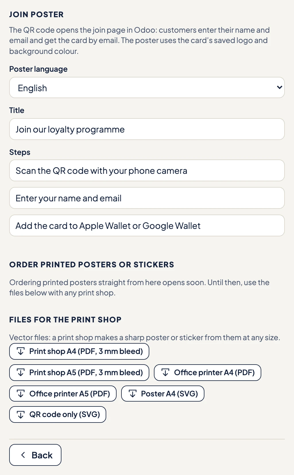
- Poster language, Title and the three Steps: the texts on the poster, printed exactly as you write them.
- Files for the print shop: A4 and A5 PDFs with 3 mm bleed for a print shop, A4 and A5 PDFs for an office printer, the poster as an SVG, and the QR code alone as an SVG. The vector files stay sharp at any size, for a poster or a sticker.
What differs between iPhone and Android
Apple Wallet and Google Wallet draw the card themselves, so some settings exist on one phone only.
| iPhone (Apple Wallet) | Android (Google Wallet) | |
|---|---|---|
| Places for fields | Top right (up to 3), Large text (1), Row (up to 4), Back | Row 1 to Row 3 (Google recommends at most 2), Pass details |
| Top of the card | Logo, and the card name next to it if you want | Fixed by Google: the logo (always shown) and the names |
| Text colours | You choose the text and label colours | Google picks black or white text |
| Field labels | Can be hidden per field | Always shown |
| Background image | A wide strip, 375 × 144 | A large image, 1032 × 812 |
| Your own rows | On the back of the card | In the pass details |
| Alert when a value changes | Your own text, for example "You now have {value} points" | Google's own "pass updated" alert |
| Near a shop | The card on the lock screen with your text | Google's nearby notification, Google's text |
Until you save a design
The card uses a standard layout: the points, the customer's name and the next reward on the front, and the expiry dates and the rewards on the back. With Customer Levels the level is on the front and the points on the back; see Customer Levels.